JS Flashcards - Design Process
This is the first in a series of articles where I will be breaking down how I put together my project JS Flashcards. What is JS Flashcards you ask? You can check out the original post introducing the project here or check out JS Flashcards here.
Starting Point for Design Choices
Trying to figure out what direction you want to go with your design choices at the start of a project is not always an easy process. I always find it easier when I have a jumping off point to work from, helping to inform my design decisions. When you are creating your own projects, a little inspiration can help kickstart the process.
When I was putting together my portfolio site, I was searching images on Unslplash and came across a picture of a giraffe that I really liked. I used the picture as my hero image and it gave me a central theme to work around. I was able to come up with a logo and tagline related to the giraffe theme. You can check out my site here.
For JS Flashcards, the inspiration that helped me to make my design choices was the JS logo. I used the yellow color of the background, the text color and the font as the starting point of my design.
- JS logo background - Minion Yellow (#F0DB4F)
- JS logo text color - Dark Charcoal (#323330)
- JS logo font - Neutraface Text Bold
Implementing the Design
Colors
For the background of the main page, I used a repeatable SVG background pattern. The background color is Minion yellow and the circuit board design is Dark Charcoal with the opacity turned down. I found the pattern on the site Hero Patterns. The patterns are free to use and there are a lot to choose from. Steve Schoger, the creator of the site also has a couple of SVG icons libraries, one free (Zondicons) and one paid (Hero Icons). I have used icons from the free set in other projects. For the text on the main page, I used Dark Charcoal.
With Minion yellow as a base color to work with, I was able to use it as the starting point to pick the other colors. First off, I knew that I wanted to use the rainbow pattern. I already had yellow and I had to figure out how to pick the remaining colors. I decided to use HSL to help choose the other colours.
Quick HSL Primer (go ahead and skip if you know how it works)
HSL stands for Hue, Saturation and Lightness and is an alternate way of representing colours. HSL is written like this:
hsl(hue, saturation, lightness)
Hue is the degree on the colour wheel from 0-360 (0 is red, 120 is green, 240 is blue). Saturation is written as a percentage. The larger the percentage, the more "colorful" the color is. Lightness is how far away from white or black the color is. A lightness of 50% means the color is perfectly balanced between light and dark. Below are some HSL resources that I have used.
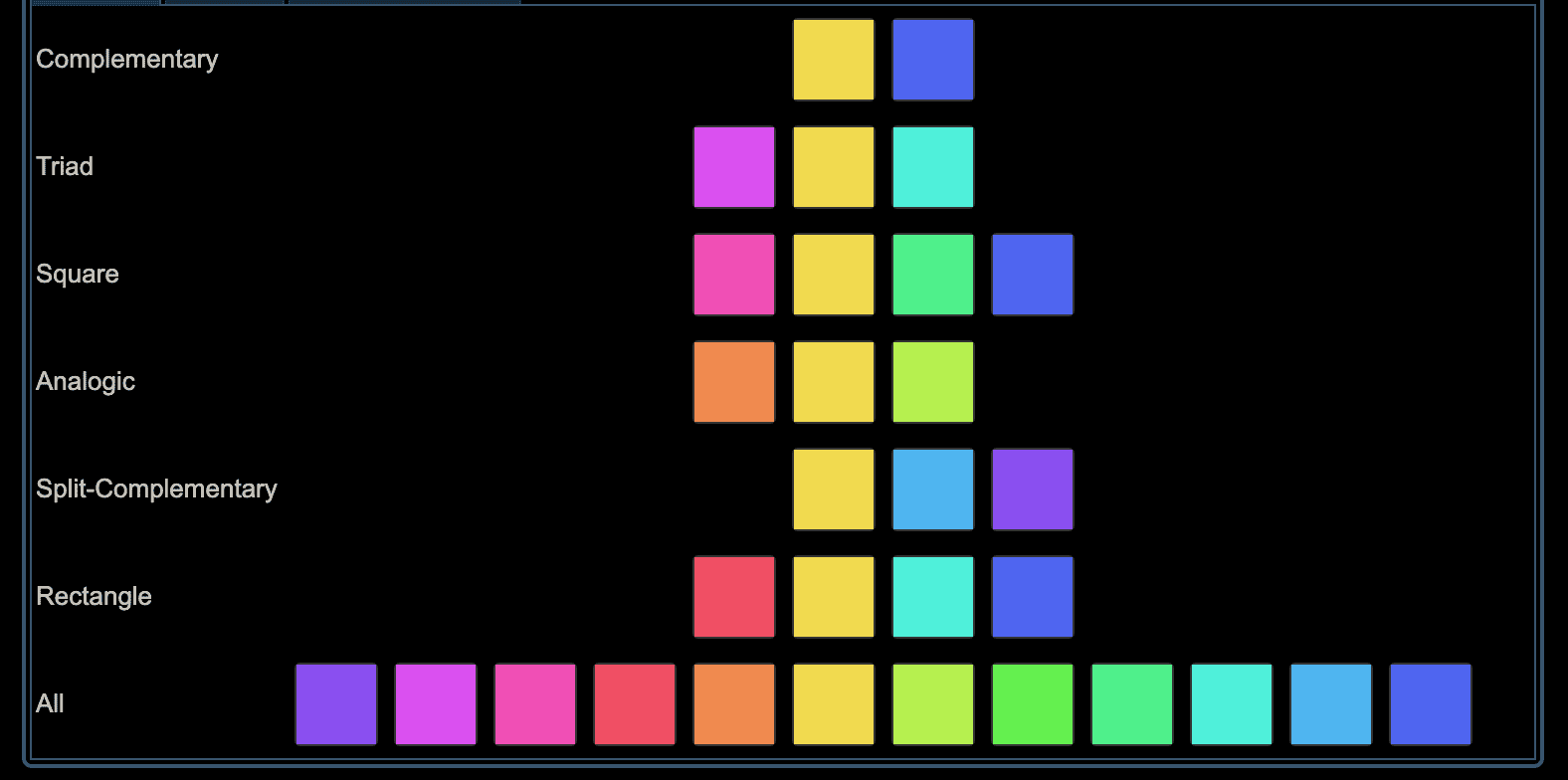
Picking the Color
I used the color generator at colorizer.org and I put in the hex value for Minion yellow - #F0DB4F - and it converted it to HSL for me - hsl(52.2, 84.3%, 62.5%)

I was then able to scroll down and see all of the other colors that it generated for me.

The benefit of the colors that it generated is that they all share the same saturation and lightness (84.3%, 62.5%) and just the hue is different. This means that the colors are all connected and they fit well together.
Colors for Section Pages
Now that I had the colors that I was going to use for my sections, I had to decide how exactly I was going to use then. What I decided to do was to use the main section color for the page background, and then use the same color for the flashcard background and text, but adjust the lightness. I made the flashcard background lighter and the text darker. Here are the HSL values:
page background - hsl(352.2, 84.3%, 62.5%)
flashcard background - hsl(355.2, 84.3%, 95%)
flashcard text - hsl(355.2, 84.3%, 20%)
I used a site called contrastratio.com to play around with the lightness and make sure I was getting a contrast ration that would be easy to read.

Now that I had all the colors, I put them together on the Basics page.

The result is all the colors work together cohesively. I then did the same process for the other sections, using the main section color for the page background and then making it lighter/darker for the flashcard background/text.
All in all, I was very happy with how the colors turned out.
Font
The font used in the JS logo is Neutraface Text Bold. It is not free to use and I wan't interested in shelling out the $125 to use it in this project, so I went with an alternative. I found an article that listed a number of designer fonts and their free alternatives. The font that it suggested was Josefin Sans, available on Google Fonts. I added it to the project and I used it on the front of all the flashcards.
That wraps up the first article in my series about how I built JS Flashcards. Stay tuned for next week's article about how I built the flipping cards.
P.S. I started my job search earlier this week. I am looking for a remote Front End Developer Position. You can find out more about it here.